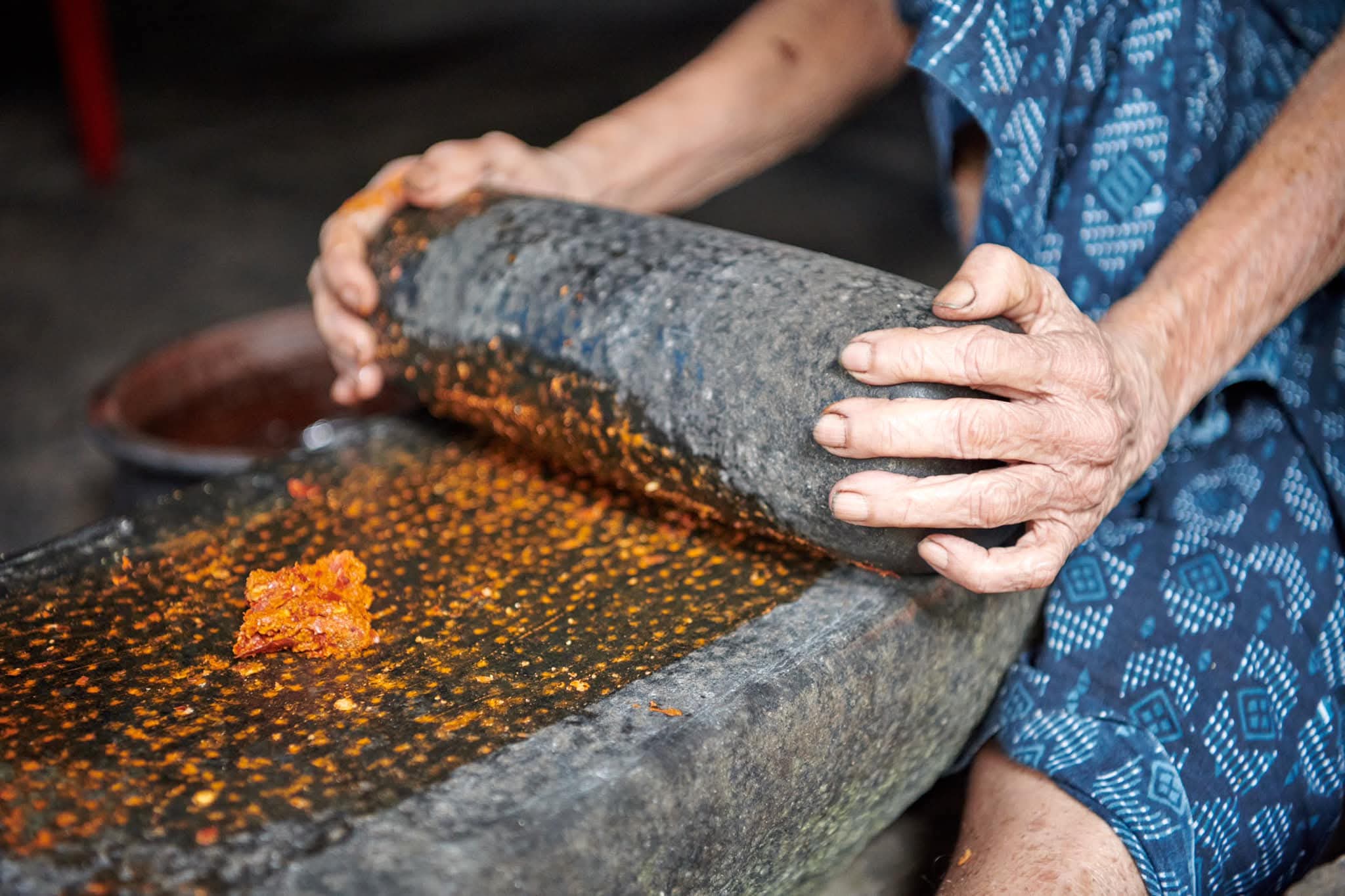
In Kerala, pepper isn’t just a spice.
It’s a story that rises with the morning mist, breathes through the forested hills, and gathers in the quiet rhythm of handpicking under monsoon skies.
So when K LA Spices came to us, they weren’t looking for just a logo or a label.
They wanted a brand that could hold the weight of generations, soil, and scent—and still feel modern enough to sit on global shelves.
And that’s exactly what we set out to create.
🌿 The Logo: A Story Told in Vines and Grains
At first glance, the K LA Spices logo is elegant and understated. But take a closer look, and it begins to speak.
Two pepper vines arch gently into the mark—one green, one black.
Their presence is intentional:
The green vine represents freshness, the raw potential of the harvest, and the brand’s deep partnership with Kerala’s farmers.
The black peppercorns, rendered in a minimal grainlike texture, symbolize precision, care, and peak flavour—a nod to K LA’s uncompromising quality.
Together, they form a visual dialogue between nature and process, origin and outcome.
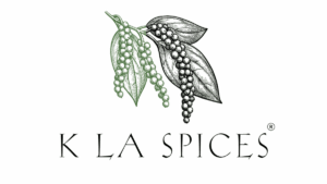
It’s a logo that doesn’t try to shout. It simply stands—confident, rooted, and clear.
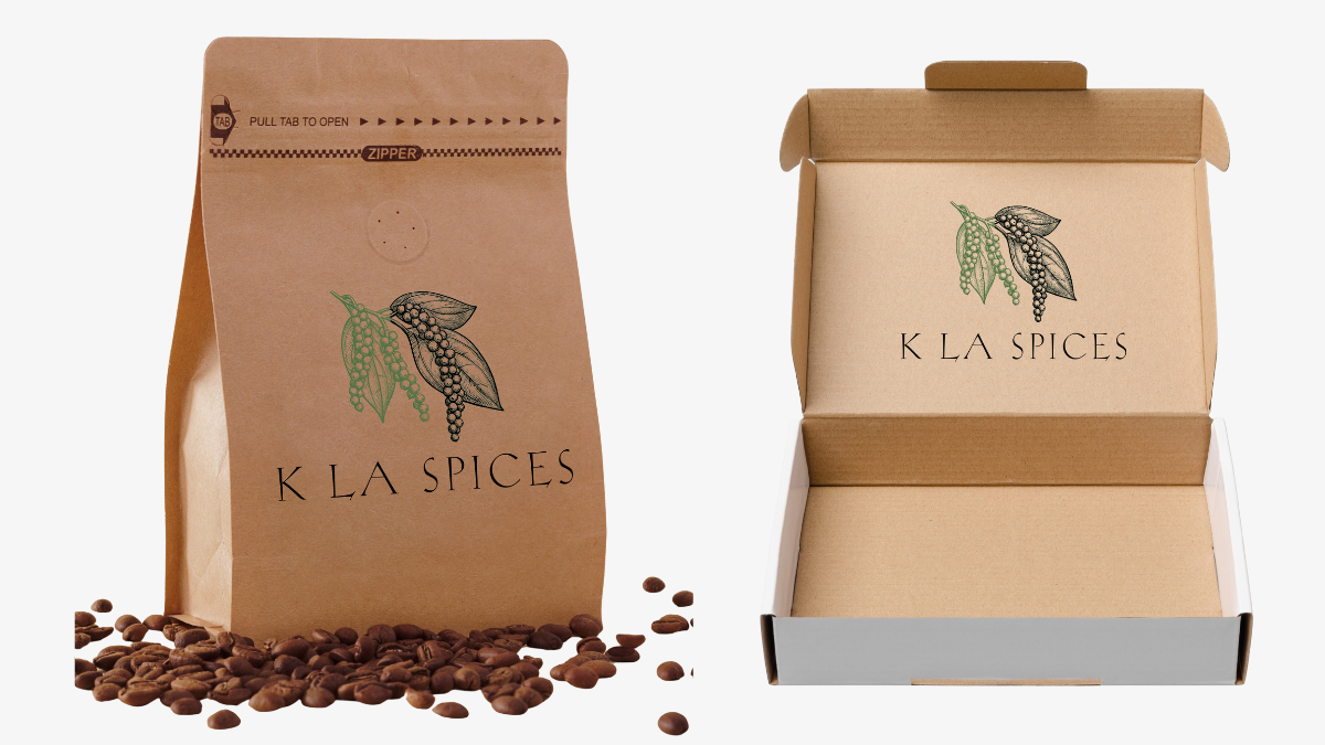
🎁 The Packaging: Minimalism with Meaning
We knew the spice aisle was a battlefield of color and clutter. So for K LA Spices, we chose a different path—bold restraint.
A clean monochrome layout lets the product breathe.
Touches of vibrant green reinforce freshness and purity.
Carefully placed white space suggests clarity and sophistication.
Simple typography whispers confidence instead of competing for attention.
The result? Packaging that doesn’t overwhelm. It draws you in with quiet authority, like a well aged recipe or a trusted hand in the kitchen.
It’s the kind of presence that turns heads—not because it demands attention, but because it deserves it.
📖 Why Story Matters (Especially in a Spice Jar)
In today’s world, customers aren’t just buying black pepper. They’re buying a story they can believe in—a traceable thread from farm to shelf, from aroma to memory.
With K LA, the story is built right in:
> “Our pepper is handpicked from small, sustainable farms in Kerala, slow dried under sun filtered canopies, and packed at peak potency.”
That’s not marketing. That’s identity.
And it shows up in everything: the logo, the language, the packaging, the design choices.
It’s not just about where the pepper comes from.
It’s about why that matters—and how it feels when you open the jar.
🌾 Design That Holds the Land
From the illustrated pepper leaves to the color coded symbolism of green and black, every detail in the K LA Spices brand was crafted to reflect:
Quality that you can trust
Freshness that stays with you
And a quiet but profound connection to the farms that grow Kerala’s black gold
Because good branding isn’t loud.
It’s honest, rooted, and sensory—just like the best spice.
Whether you’re holding their packaging, spotting it on a shelf, or reading the label at home, K LA Spices feels different. It feels intentional. It feels like something that’s been cared for—from the soil it grew in, to the design it wears now.
And that, to us, is the power of thoughtful branding.